Just as 2016, 2015 and 2014 I produced an Open Access Heatmap 2020. It shows how many Open Access journals are published per country using data provided by the Directory of Open Access Journals (DOAJ).
The heatmap can be found here or embedded some lines below.
I calculated the number of Open Access Journals per country as listed by the DOAJ (this quite trivial data can be downloaded as a CSV file here, it was retrieved from the DOAJ yesterday). Using this CSV file with the online service CartoDB I produced the following heatmap visualizing the number of Open Access Journals per country. Please note that the map is generated by CartoDB and that CartoDB’s terms of use and terms of service apply. Click on a country to see how many Open Access Journals are published there.
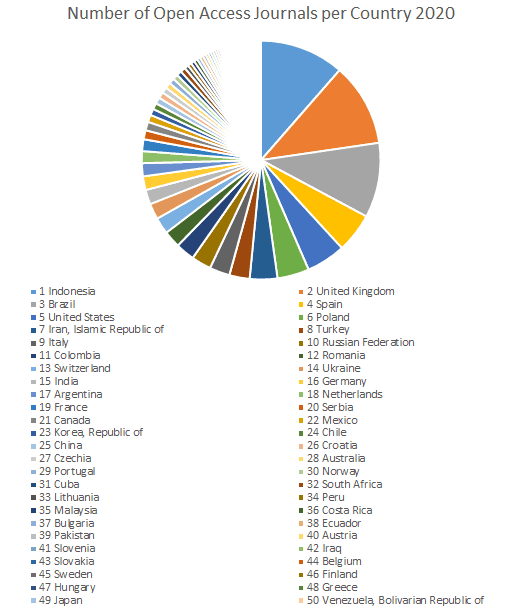
The countries publishing most of the Open Access Journals
The countries publishing most of the Open Access Journals in the heatmap 2020 and listed in the DOAJ are:
| Country | Number of Open Access Journals 2020 |
| Indonesia | 1,641 |
| United Kingdom | 1,617 |
| Brazil | 1,458 |
| Spain | 768 |
| United States | 763 |
| Poland | 619 |
| Iran, Islamic Republic of | 536 |
| Turkey | 396 |
| Italy | 395 |
| Russian Federation | 384 |
In 2016 the ranking was dominated by Brazil (873), the United Kingdom (754) and the United States of America (675). The following graphic shows the shares of journals from the fifty countries producing the highest output of Open Access Journals.
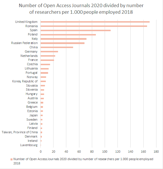
Number of Open Accces Journals per Country 2020 and share of scientists among 1.000 employees in a country 2018
In addition, I obtained information on the share of scientists among 1.000 employees in a country from the OECD website to enrich the data of the Open Access Heatmap 2020. Unfortunately, this information was only available for a few countries and dates from 2018.
| Country | Number of Journals (2020) | Number of researchers per 1.000 employees (2018) |
| United Kingdom | 1617 | 9.527 |
| Spain | 768 | 7.038 |
| Poland | 619 | 7.196 |
| Italy | 395 | 5.524 |
| Russian Federation | 384 | 5.608 |
| Romania | 330 | 1.990 |
| Germany | 264 | 9.663 |
| Netherlands | 233 | 10.255 |
| France | 230 | 10.883 |
| Korea, Republic of | 125 | 15.326 |
| China | 122 | 2.405 |
| Czechia | 113 | 7.627 |
| Portugal | 109 | 9.471 |
| Norway | 102 | 12.159 |
| Lithuania | 80 | 6.404 |
| Austria | 55 | 11.366 |
| Slovenia | 53 | 9.893 |
| Slovakia | 46 | 6.751 |
| Belgium | 44 | 12.018 |
| Sweden | 43 | 14.777 |
| Finland | 37 | 14.517 |
| Hungary | 36 | 6.813 |
| Greece | 35 | 8.614 |
| Japan | 34 | 9.842 |
| Taiwan, Province of China | 32 | 13.468 |
| Denmark | 29 | 15.652 |
| Estonia | 27 | 7.744 |
| Ireland | 16 | 11.622 |
| Latvia | 11 | 4.098 |
| Luxembourg | 3 | 6.653 |
The following graph puts the columns of this table into relation and shows the number of Open Access Journals 2020 divided by number of researchers per 1,000 people employed 2018. A high value indicates countries that have a high output of journals with a comparatively low number of scientists. Conversely, a low value indicates countries that have a low output of journals with a relatively high number of scientists.
Limitations
Please note that the Open Access Heatmap 2020 has only illustrative value and of course it is obvious that it needs to be contextualized with other information to allow profound conclusions. Anyone who wants to have more detailled or granualar information is invited to take the data available on the web and to build heatmaps that visualize for instance the number of Open Access articles published per country. Of course it may also be useful to take other indicators into account as consumer price index or expenditures for research.
Although I am very well aware of all these limitations of the Open Access Heatmap 2020 published here unfortunatley I do not have the time to collect the data and build these maps – it is up to the Open Access community to do so if it thinks better maps are needed. Please feel free to use the CSV file and mash it up with other data just as Christian Heise did with the data from 2015.

Graduate sociologist, information scientist (PhD degree), associate of scidecode science consulting – De Castro, Herb, Rothfritz GbR, working for the Saarland University and State Library (Germany)